
Project Overview
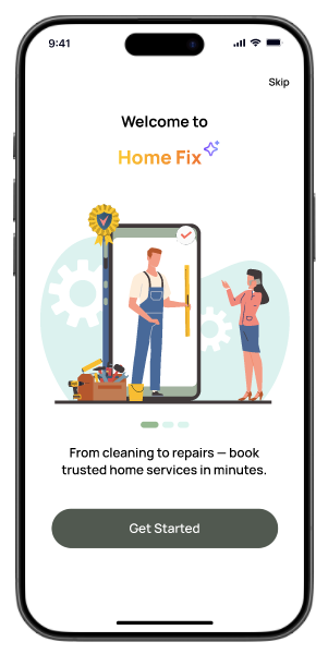
- Home Fix is a home services startup that connects customers with local service providers through web and mobile app.
- The platform features an AI-powered questionnaire that guides users to estimate service costs and timelines before booking. While the focus was on the customer journey, the provider’s perspective was considered to ensure smooth interactions.
- Our team was tasked to create a user-centered, intuitive, and accessible platform with a flexible dashboard that builds trust and enhances user confidence throughout the service booking journey.
Business Goals
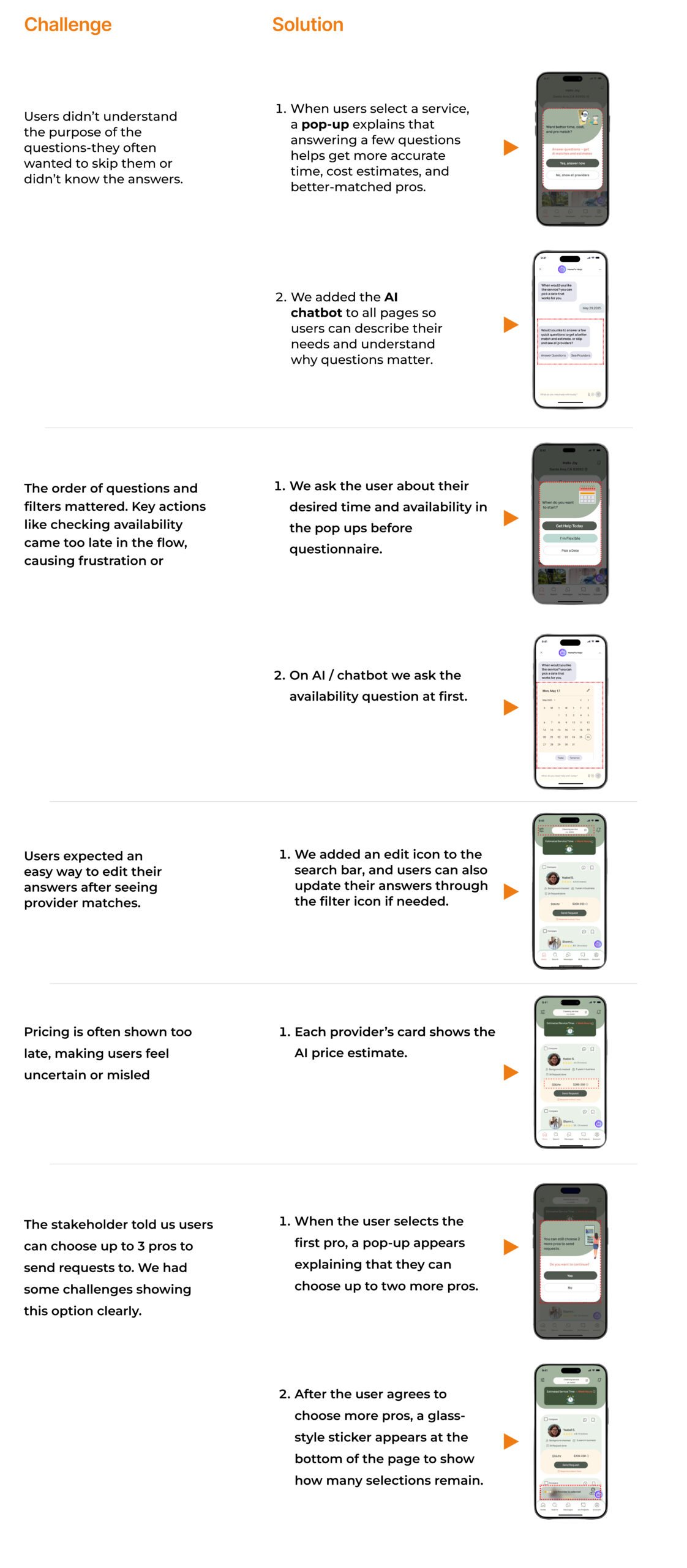
- Show clear request details to reduce user–provider chats and keep payments on the platform.
- Introduce AI in a few questionnaire questions, keeping the experience simple and user-friendly.
Constraints
We were six teams working on different tasks for a home service app, with every two teams sharing a similar flow. Our focus was on electrical and cleaning services, and we had to deliver one final output. Despite challenges in aligning our work, through A/B testing we were able to finalize the design.
Design Process
We followed the Double Diamond design process, where iteration played a key role in shaping and refining our solutions based on user feedback and research findings.
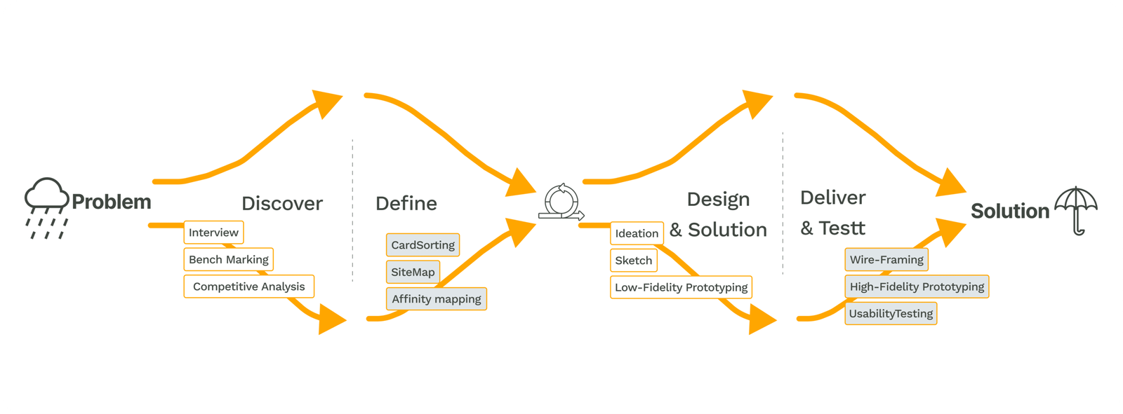

Discover
We ran benchmarking and Competitive Analysis to better understand our users and shape the design around their actual needs.
Benchmarking
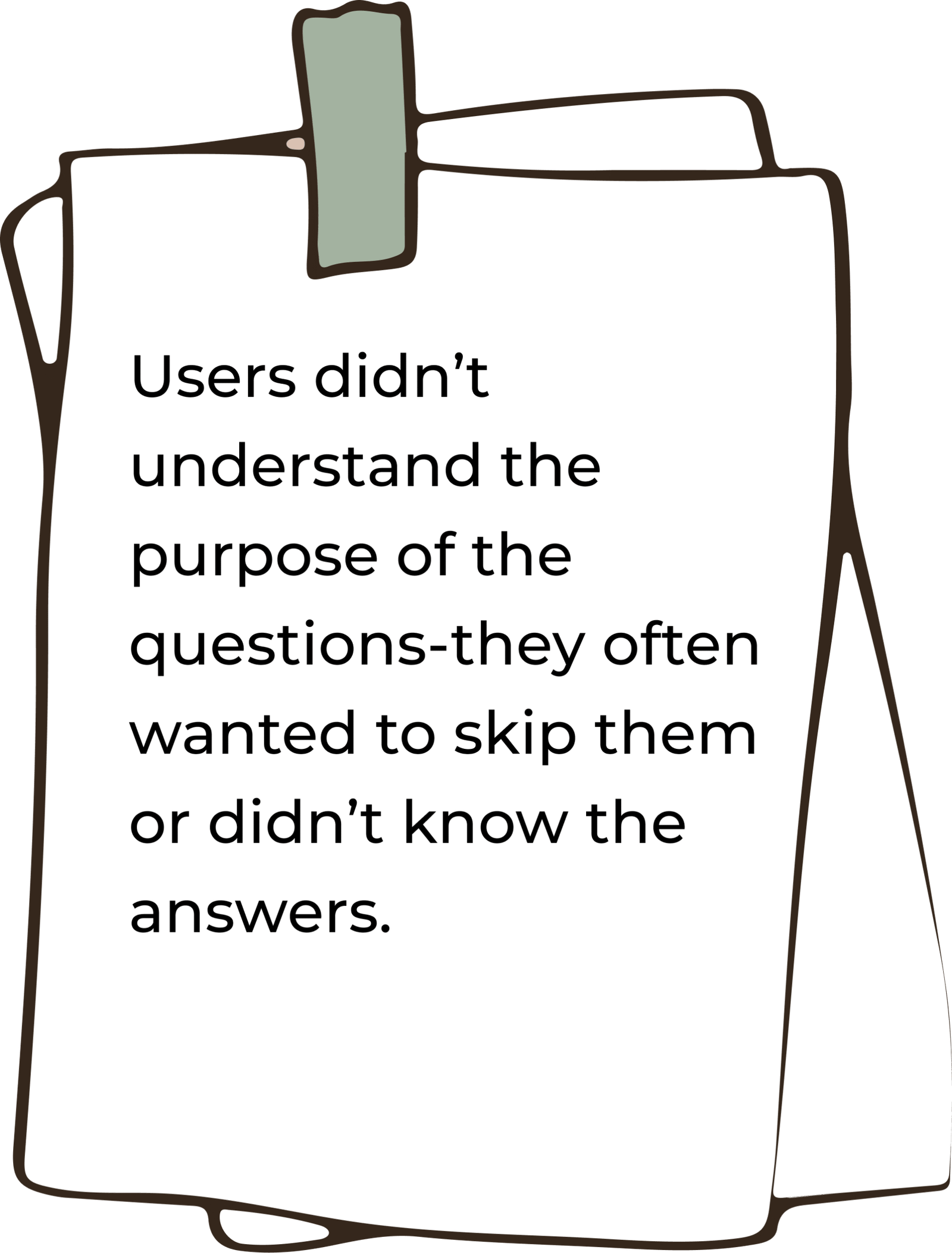
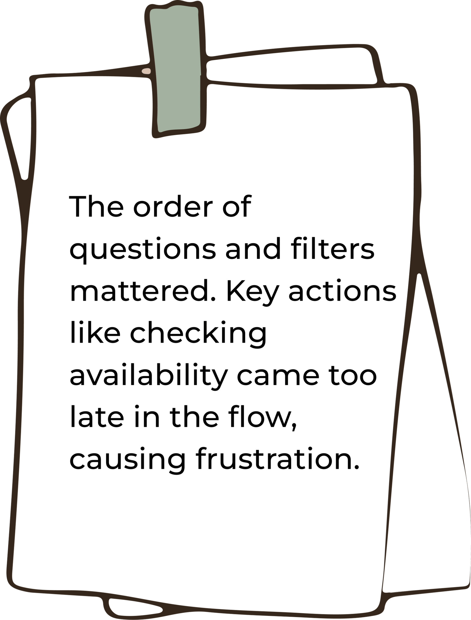
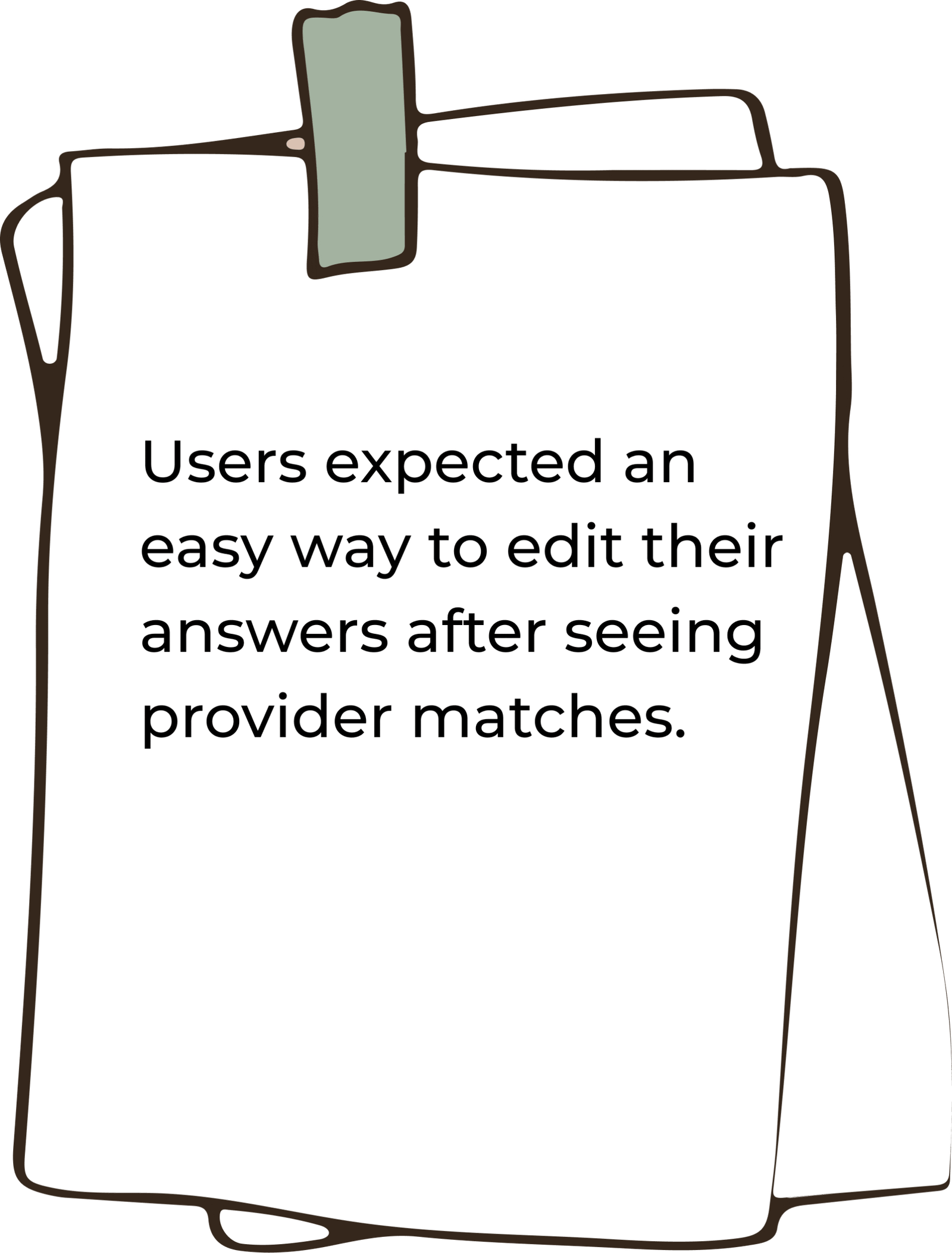
We conducted benchmarking sessions with four users, asking them to book services on Angi and Thumbtack. We chose these platforms because, unlike many others, they guide users through a questionnaire before showing results. This approach helps gather more detailed information up front, leading to better estimates and more tailored service options. By observing user interactions, we identified common behaviors and pain points in this flow.
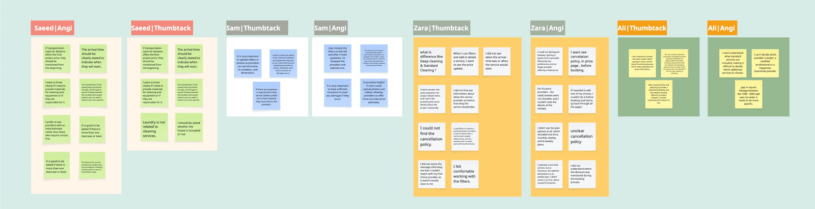
This is the outcome:
Competitive Analysis
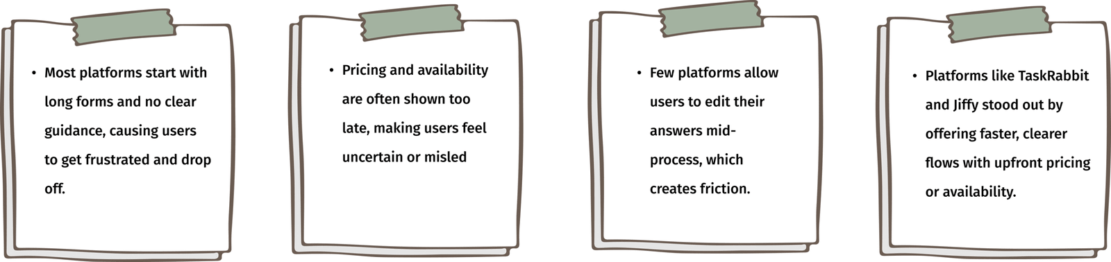
We conducted a competitive analysis between platforms like Angi, Thumbtack, TaskRabbit, Handy, Jiffy, Porch, and Yelp. We compared them across key features such as booking flow type, questionnaire usage, editing flexibility, price visibility, and standout UX/UI elements.
This is the outcome:

Define
At the Define stage, we used data from the Discover phase to understand our main challenges and started exploring solutions for the first phase of design.
Persona

StoryBoard

Cardsorting
To improve website navigation and structure, we ran 5 remote open card sorting sessions with potential users and the stakeholder. The goal was to identify clear, effective labels and understand how users expect to browse home service content.
👇🏼Here’s a sample from one of the sessions.
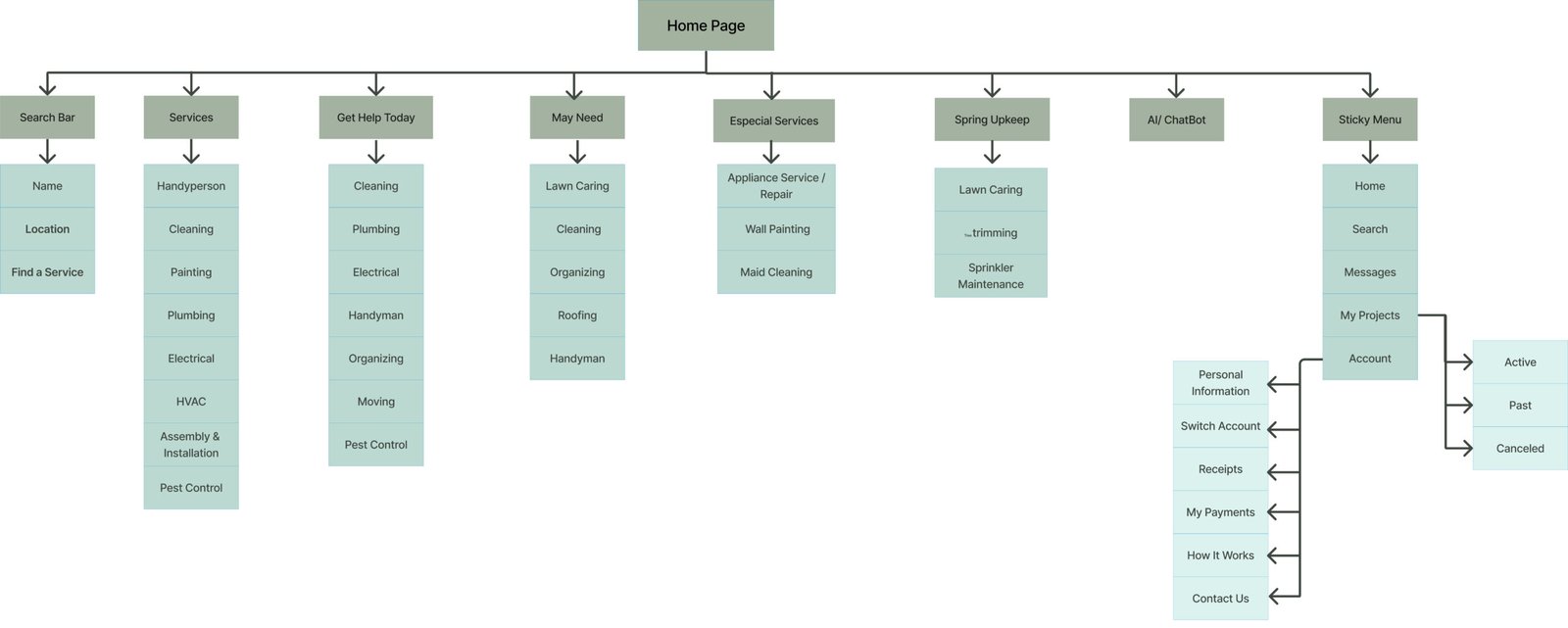
Sitemap
After completing the card sorting, we created our site map. It went through several iterations during the process, but we were eventually able to finalize the version shown below.
Design
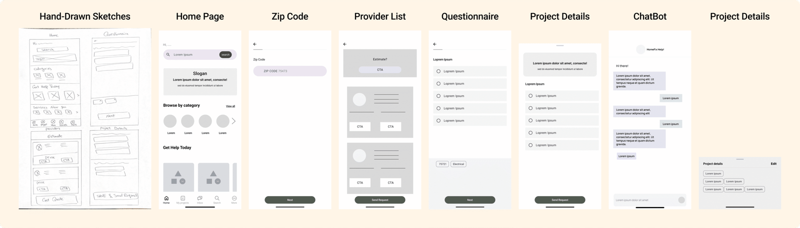
At the Design stage, we started with sketches. First, we worked on the questionnaire, then designed the user flow through the chatbot. Below are some hand-drawn and low-fidelity sketches.
UI Design
After creating sketches, we worked on our UI kit and mood board to ensure consistency across all design groups. The mood board was inspired by themes of home services and AI-driven chatbot assistance.
Mood Board

UI Kit

Deliver & Test
At the delivery stage, we went through many iterations to understand how users interact with different chatbot designs and questionnaire formats. In the end, we created two final designs to test.
Phase 01: Choosing the best layout for Chatbot AI
At the delivery stage, we went through many iterations to understand how users interact with different chatbot designs and questionnaire formats.
We conducted A/B testing on 2 different layouts.
Push in
Push in


We ran an A/B test and found that users preferred the grid layout over the vertical list. It made scanning easier and reduced scrolling when there were many items.
Phase 02: Finding the Best Interface
We created these two different chatbot layouts to explore the balance between space efficiency and usability.
- The Grid Layout allows users to see all options at once without scrolling, which is ideal for quick selections.
- The Vertical List offers better readability and accessibility by providing more space for each item, especially for mobile users.
Because defining a project involves answering different types of questions, we wanted to see which experience feels easier for users: changing pages or scrolling. So, we tested two types of interactions: (1) push-in screens, and (2) vertical scrolling on one page.